Morrow Clay
A calmer home for small-batch ceramics.

- Sector / Year
- Craft and independent retail
2026 - My role
- Content structure, interface design, and development
- Scope
- Collection catalogue, piece pages, workshops, and stockists
- Built with
- Statamic · Antlers · CSS
The brief
Morrow Clay makes tableware in small batches. Its website needs to introduce the work, explain the differences between pieces, and make the next workshop easy to find. The practical information matters as much as the photography: dimensions, care instructions, availability, and where to see the work in person.
I organised the site around two reasons to visit: finding a piece and spending time in the studio. That gives the catalogue and workshops their own clear paths while keeping the maker’s story close to both.
Let the objects set the pace
The catalogue uses generous images and compact descriptions. A visitor can compare shapes without opening every page, then look closer at glaze variations and small details on an individual piece.
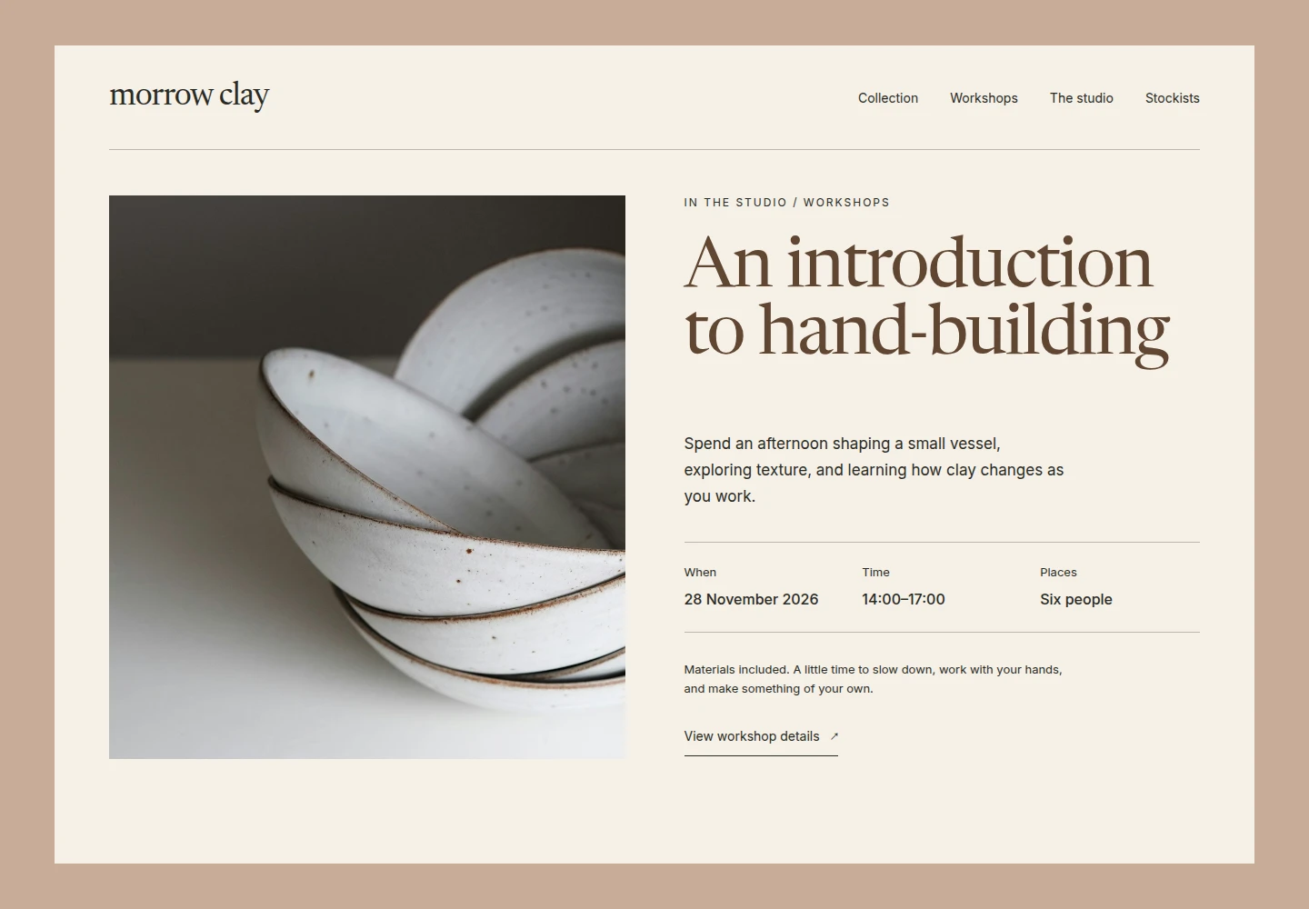
A restrained clay-and-cream palette supports the photography. Product information stays in a consistent position, so a shallow bowl and a tall pouring jug remain easy to compare even when their stories differ.
Keep recurring information together
Care instructions and stockist details should not need to be rewritten for each piece. Shared information lives separately from the description of an individual object. Workshop entries have their own date, duration, capacity, and practical notes.
The catalogue does not include checkout. Its job is to help people understand the work and choose their next step without introducing a second system for orders and inventory.
The editing experience
Adding a piece begins with a name, a short description, dimensions, and a gallery. The studio can choose an availability label and connect the piece to a collection. Workshop updates use a different set of fields, keeping event details out of the catalogue form.
The structure gives each kind of content a clear home. It also leaves room for a piece to stay visible after a batch has sold, with its availability explained rather than its story removed.
What this project brings together
The strongest decision was to separate the catalogue from the workshop programme while letting them share the studio’s visual language. Visitors get distinct routes through the site; editors get forms suited to the information they are changing.